Charts in Ms-Excel


Charts in MS- Excel
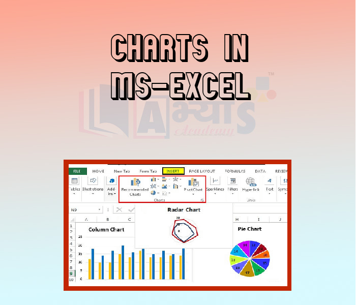
It is sometimes difficult to interpret the Excel data due to complexity and size of data. So, charts are a way to represent the data graphically and interpret the data easily. Charts are the visual representation of data. Excel provides charts to take advantage of graphical representation. The data represented through charts is more understandable than the data stored in an Excel table. This makes the process of analyzing data fast. Excel users can fast analyze the data. A chart is a tool you can use in Excel to communicate data graphically. Charts allow your audience to see the meaning behind the numbers, and they make. showing comparisons and trends much easier.
________ chart is basically a vertical chart that is used to represent the data in vertical bars. __________ charts are horizontal bars that work like column charts. | |||
| Right Option : B | |||
| View Explanation | |||
What type of chart is good for single series of data? | |||
| Right Option : B | |||
| View Explanation | |||
Which of the following charts shows the relationship of parts to a whole ? | |||
| Right Option : A | |||
| View Explanation | |||
Students / Parents Reviews [10]
My experience with Abhyas academy is very good. I did not think that my every subject coming here will be so strong. The main thing is that the online tests had made me learn here more things.

Hiya Gupta
8thAbhyas Methodology is very good. It is based on according to student and each child manages accordingly to its properly. Methodology has improved the abilities of students to shine them in future.

Manish Kumar
10thBeing a parent, I saw my daughter improvement in her studies by seeing a good result in all day to day compititive exam TMO, NSO, IEO etc and as well as studies. I have got a fruitful result from my daughter.

Prisha Gupta
8thI have spent a wonderful time in Abhyas academy. It has made my reasoning more apt, English more stronger and Maths an interesting subject for me. It has given me a habbit of self studying

Yatharthi Sharma
10thIt has a great methodology. Students here can get analysis to their test quickly.We can learn easily through PPTs and the testing methods are good. We know that where we have to practice

Barkha Arora
10thIt was a good experience with Abhyas Academy. I even faced problems in starting but slowly and steadily overcomed. Especially reasoning classes helped me a lot.

Cheshta
10thMy experience with Abhyas is very good. I have learnt many things here like vedic maths and reasoning also. Teachers here first take our doubts and then there are assignments to verify our weak points.

Shivam Rana
7thOne of the best institutes to develope a child interest in studies.Provides SST and English knowledge also unlike other institutes. Teachers are co operative and friendly online tests andPPT develope practical knowledge also.

Aman Kumar Shrivastava
10thAbout Abhyas metholodology the teachers are very nice and hardworking toward students.The Centre Head Mrs Anu Sethi is also a brilliant teacher.Abhyas has taught me how to overcome problems and has always taken my doubts and suppoeted me.

Shreya Shrivastava
8thAbhyas is a complete education Institute. Here extreme care is taken by teacher with the help of regular exam. Extra classes also conducted by the institute, if the student is weak.